gogreen

Chart explained

Chart explained

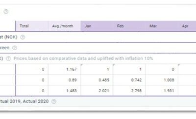
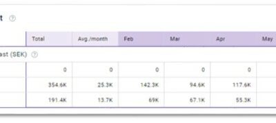
Summary Part of Doing section. Intended Users Maintenance Manager, Executive Chef, Styling Manager, Other Department Heads, General Manager and higher. Requirements Access to GoGreen Role. Instructions  You can change the period to a different month in the annual...
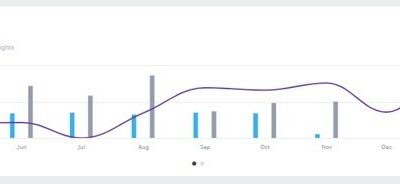
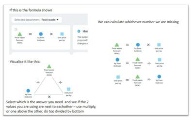
read more

Volume/usage/consumption explained

Example used is kWh from GoGreen. This shows the quantity of each resource we expect to use.  The values come from the Live Forecast when this plan was first created.  It’s fair to say that the values may differ in Live Forecast today, that’s why best practise is to...

read more
Unit price explained

Unit price explained

Example used is Energy. This shows an estimated average price for each month in the plan and is combined with the usage (multiplied) to get the values. You can edit these prices as required. You can see there is added a price of 1 for gas in most months below. The...

read more
Save your progress explained

Save your progress explained

The ‘Save changes’ button will ensure your changes are saved for next time you or anyone else comes back to this plan.  At this stage the values only exist in this view.  In order to make the plan values (cost of energy and estimated unit prices) available anywhere...

read more
Plan values explained

Plan values explained

Example used is Energy. This first section in the data table is the plan (budget) numbers in the currency shown in the header. It displays in thousands (K) and in the local currency.These values cannot be edited directly. They reflect values in the next sections based...

read more
Main chart explained

Main chart explained

Example used is Towels & linen Use this chart to see at a glance the general shape of your plan (blue bars) against the comparative period (gray) as pre-set and the level of guest nights planned (purple line). This enables you to see if the cost level decreases...

read more

Goal charts and YoY comparison explained

The charts below (Towels & linen and Energy are used in this example), displays whether your plan shows year-on-year (YoY) improvement, considering the activity levels.   The plan values for each month are divided by a relevant productivity measure such as guest...

read more
Formula/Calculations explained

Formula/Calculations explained

The diagram below shows the correlation between the formula elements which calculates the unit price to get the plan value you expect.In the diagram here below the forecast comes from kg from GoGreen multiplied by price per kg. Always ensure you are in the...

read more
Comparative data explained

Comparative data explained

What is comparative data?  It is a set of data that you compare your draft plan against.  The dataset shown under comparative data is also used to calculate other elements of your new plan.  Look for … ‘based on comparative data’… in a section header like...

read more