Portfolio Perspective overview
What is the Portfolio perspective?
The Portfolio Perspective is an overview of the full portfolio, including Room revenue, Hours, and Labor cost. It gives the user oversight of the status month to date, month end, year to date and year end. The data for the past 3 months is updated every hour. For data beyond 3 months, it is recalculated daily at 2 AM.
What is its purpose?
The Portfolio perspective is designed to provide head office and regional directors with a bird’s eye overview of the relevant properties. It gives a quick overview of how the different properties are performing on revenue, labor cost and forecasting accuracy. The color coding quickly highlights the properties that are pacing behind, and those that are performing well.
How do I access the screen?
Access the screen from the side menu on the PMI main page. Anyone with access to Benchmarking also has access to the Portfolio perspective.
Portfolio view options
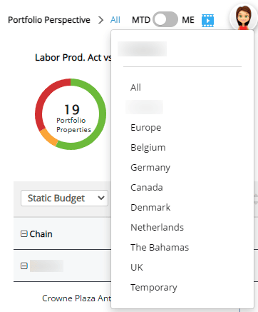
- From the dropdown menu, you can select to view all properties, a group, or an individual property. If a property is categorized as “Not live”, it will not be included in the chart below.
- You can also create a custom group of properties to view. This is done via the User settingspage in PMI. Once created, the custom group will be visible in the dropdown.
- Use the slider to view Month to Date (MTD), or Month End (ME).
- Month to Date shows the actual result from the 1st of the month up to today, and compares with the budget/forecast for the same period
- Month End shows the Live forecast for the month compared to the Forecast/Budget selected.
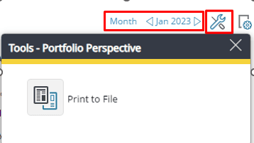
- The Date selector is at the top right of the page, you have the option to view a Month, or Year. If you select to view Year, the data will be taken from the 1st of the year up until today’s date, and then data from the Live forecast will be used to give the best prediction for the end of the year outcome.
- The Tools icon gives you the option to export the data to an excel or Google sheets spreadsheet.
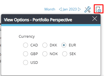
- From the View options icon, select the currency to view
Color coding
The color coding follows the same logic across all parts of the screen:
- Green: You are on pace to meet or do better than the selected comparative data (either forecast, budget or last year).
- For productivity, revenue and forecast accuracy, this means a higher result than Forecast/Budget/Last year.
- For Labor cost and total hours this means a lower result than Forecast/Budget/Last year.
- Amber: You are near pace (less than 5% off) to meet the selected comparative data result.
- This indicates that you almost met the selected goal, and with some adjustments you may be able to get back on track to meet the goal.
- Red: You are more than 5% below pace to meet the selected comparative data result.
- This suggests that you are behind compared to the Forecast/Budget/Last year. It may be an idea to review the reasons for this and consider actions to implement for future improvements.
What information is displayed on the screen?
Labor Productivity Actuals vs SMART Forecast diagram
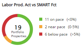
- The Labor productivity diagram shows how many of the selected properties are on, near, or below pace to meet the labor productivity forecast for the selected period.
- The circle diagram is designed for a portfolio manager to keep a regular eye on throughout the month so that corrective actions can be taken in time to meet the target for the period.
- The number in the middle of the circle is the number of properties that are being displayed.
- Hover over the colors to view a tooltip with more details. If you click on different parts of the circle or the ranking next to it, a table with a sorting function will appear, showing how the relevant properties are pacing.
- Click on one of the properties to view their Management Perspective and take a closer look at that specific property.
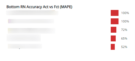
Bottom Room Night Accuracy Actual vs Forecast chart
- This chart ranks the properties according to the least accurate Room nights forecast.
- The 5 worst performing properties are shown. This is to highlight the properties that may need additional focus or support.
- This is calculated based on actuals compared to the monthly static Forecast.
- When viewing MTD, it compares the Live forecast with the monthly forecast.
- If Month End is chosen, actuals will be used up until today, and then data from the Live forecast for the rest of the month will be compared with the monthly forecast for the selected period.
- The accuracy is displayed as total MAPE (Mean Absolute Percentage Error) of the daily accuracy between the forecast and actual room nights.
- MAPE is a metric that defines the accuracy of a forecasting method. It represents the average of the absolute percentage errors of each entry in a dataset to calculate how accurate the forecasted quantities were in comparison with the actual quantities.
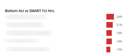
Bottom Actual vs SMART Forecast Hours chart
- Here, the properties are ranked according to the least accurate staffing schedule, compared to the SMART Forecast.
- The SMART forecast is the number of hours that should be used to meet the monthly productivity forecasts set.
- The 5 properties with the largest deviation from the forecast are shown. This indicates that these properties may need additional support in accurate forecasting.
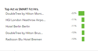
Top actual vs SMART Forecast hours chart
- Here, the properties are ranked according to the most accurate staffing schedule, compared to the SMART Forecast.
- The SMART forecast is the number of hours that should be used to meet the monthly productivity forecasts set.
- The 5 properties with the best hours vs forecast are shown here. The number is negative while the bar is green because it shows that less hours are being used than the Forecast suggests, which is a good thing.
- Typically, the bottom and the top rankings are best considered in relation to RN accuracy.
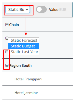
Data set view options
- Select the data to compare actuals against, either Static Forecast, Static Budget, or Last Year’s actual result.
- This selector affects the table below but does not affect the data above the table.
- Select the cross icons to expand or collapse rows. Click on a property to view their Management Perspective, for a more detailed view on the specific property.
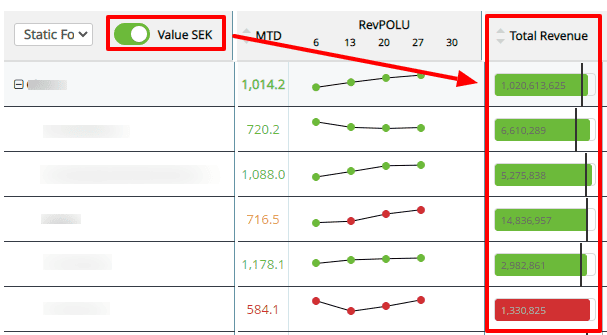
- The value selector gives the option to view the Total Revenue data as a currency or as a percentage. Be aware that this changes the values in each of the columns.
RevPOLU chart
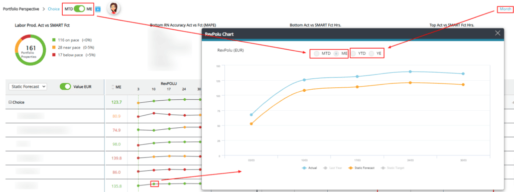
- This section shows the average Revenue Per Operational Labor Unit for the selected period.
- Hover over the numbers in the column to see a tooltip with the Actuals, Live and Static forecast data points.
- In the RevPOLU trend graph, the month is divided into 5 weeks.
- Hover over a plotted point to see a popup with the actuals and Static forecast.
- Click on any plotted point on the chart for a larger chart showing additional details and comparisons.
- The Month to Date and Month End view options in the pop-up chart are dependent on the view choices selected on the main page.
- If Year is chosen instead of Month, the chart will display the Year to Date and Year End data.
Total revenue, hours, and labor chart
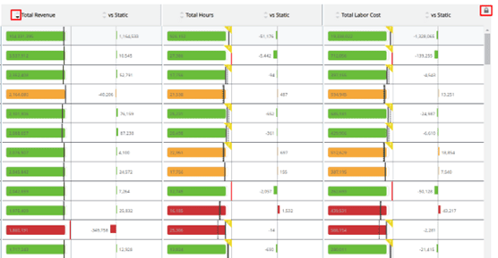
- The lock/unlock feature to the top right of this chart allows you to freeze the header while scrolling down to view more properties.
- Each of the columns can also be sorted in ascending or descending order within a group.
- Be aware that making a selection in one column will also affect the sorting order in the other columns.
- The solid black line shows the selected comparative data, either Forecast, Budget or Last year.
- The dotted line indicates the SMART forecast. This adjusts the forecast based on the activity levels at the hotel.
- A red line indicates that the difference between actuals and the comparative data is so great that it exceeds the limits for the bar.
- A grey bar indicates that only the Live forecast/actual data is shown. The comparative data selected is not available.
- If a bar is blank, it means that no actual data is available in PMI.
- An amber triangle with a question mark (?) in the corner indicates that yesterday’s hours are missing or not fully updated in PMI.
- The vs Static column indicates the amount that you are pacing ahead or behind the Live forecast.

