NextGen Rooms live forecast overview
What is the Rooms live forecast?
The Rooms live forecast in PMI is a daily revenue forecast which allows you to forecast room nights and average room rate (ARR), which then gives you the total expected room revenue per day. It is a rolling forecast which is updated daily depending on the latest expectations due to changes in the market, new reservations, cancellations, etc.
The Live forecast updates with actual data for past days, and current Live forecast for future days. This differs from the standard monthly Forecast in PMI, which, once set, does not change.
The Forecast serves as a monthly goal or target. The Live forecast allows you to track whether you are on pace to meet the monthly Forecast. This gives you the opportunity to adjust your short-term plan during the month for a greater chance of meeting your goal.
What is the purpose of the Rooms Live forecast?
There are 3 main functions of the Rooms Live forecast:
- Provides a reliable and up to date 12-month forecast for room nights, average room rate and the resulting room revenue.
- Allows you to track how you are pacing month to date in relation to your month end goal (monthly Forecast).
- The reliable Live forecast allows you to effectively plan other resources using this forecast as a basis. For example, staffing in housekeeping and food purchases for breakfast can be accurately estimated based on the data provided by the Live forecast.
How is a Live forecast created?
The way a Live forecast is created is dependent on your property’s Live forecast configuration settings. There are 3 main set up modes:
- PMI automation (PMI prediction and machine learning drivers): The Live forecast is automated based on PMI prediction. There is an option to manually override the prediction for a specific day by using the Pickup column.
- Import: The Live forecast is imported daily from an external source. Here is an option to manually override the values for a specific day by using the Pickup column, until a new forecast is imported.
- Manual: No automatic forecasting is used. The user needs to manually input forecast values for all days.
How to use the Live forecast
Regardless of which Live forecast option is being used, there are 2 main actions to be taken in the Rooms Live forecast:
- Review and adjust Live forecast for the next 4 weeks. Weekly (5 minutes).
- This is done to ensure that the coming period’s Live forecast is reliable and can be used as a basis for forecasting.
- Submit Live forecast to forecast for the next 3 months. Monthly (10 minutes).
- This ensures the monthly revenue forecast includes the latest updates and changes to the expected occupancy.
What is shown in the Rooms Live forecast?
View options
The page displays Room nights or Guest nights (A1) and Revenue (room revenue x ARI), Occupancy % or RevPAR (A2).
Use the calendar to select the period you want to view (A4). You can also add a filter to view specific days within the selected period. (A3)
Period status review
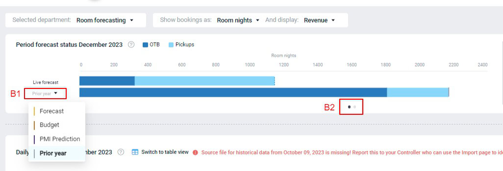
The Live forecast bar shows the breakdown of OTB and Pickups for the total period selected. You can choose to compare the Live forecast to the Forecast, Budget, PMI prediction or a Prior year (B1).
Use this to evaluate if the Live forecast is as expected compared to the comparative data.
The two dots below the bars (B2), allow you to toggle between the current graph and the Alert overview for the next 12 months graph.
The blue highlighted area is the period you are displaying on the page. Hovering over the alerts will give a brief explanation of what is out of the ordinary. See sense check section for alert descriptions. If you click on one of the alerts, the page will display the corresponding data for that period. This is a useful reference point if you need a quick review of the reliability of your long term forecast. Periods with a lot of alerts may need another closer review.
Rooms adoption index
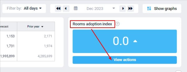
The Rooms adoption index score can be seen in the blue box in the top righthand corner. Clicking on View actions will take you to the Rooms management adoption index page.
Daily graph
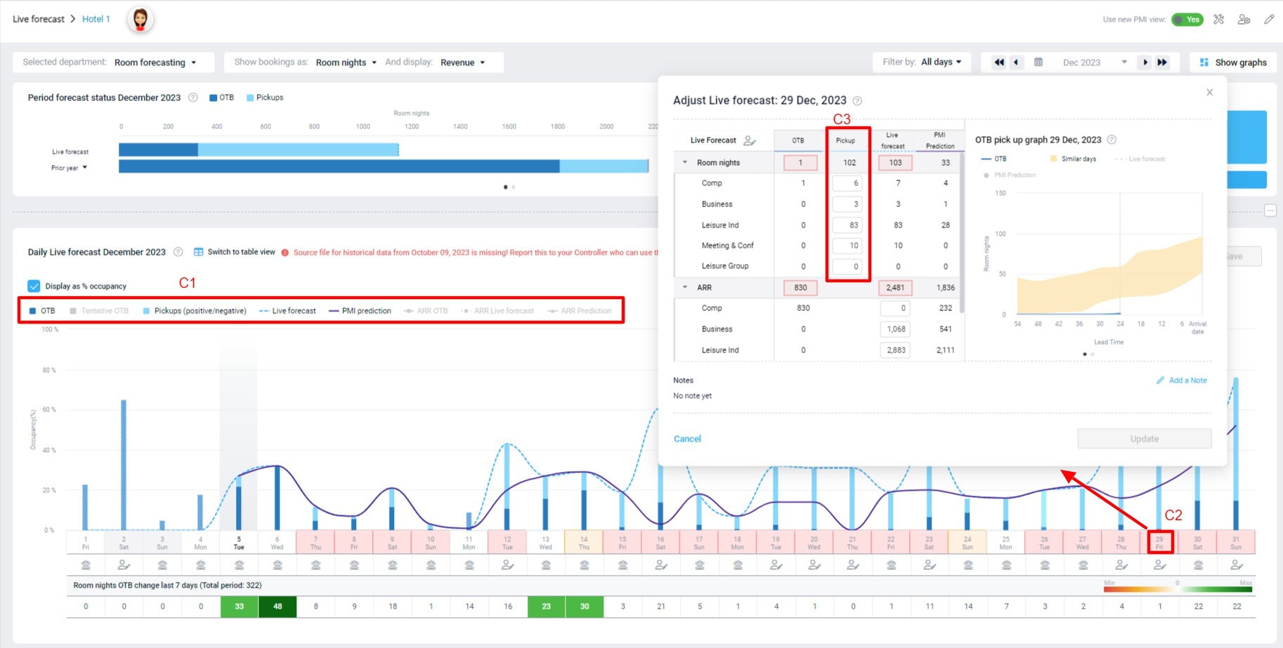
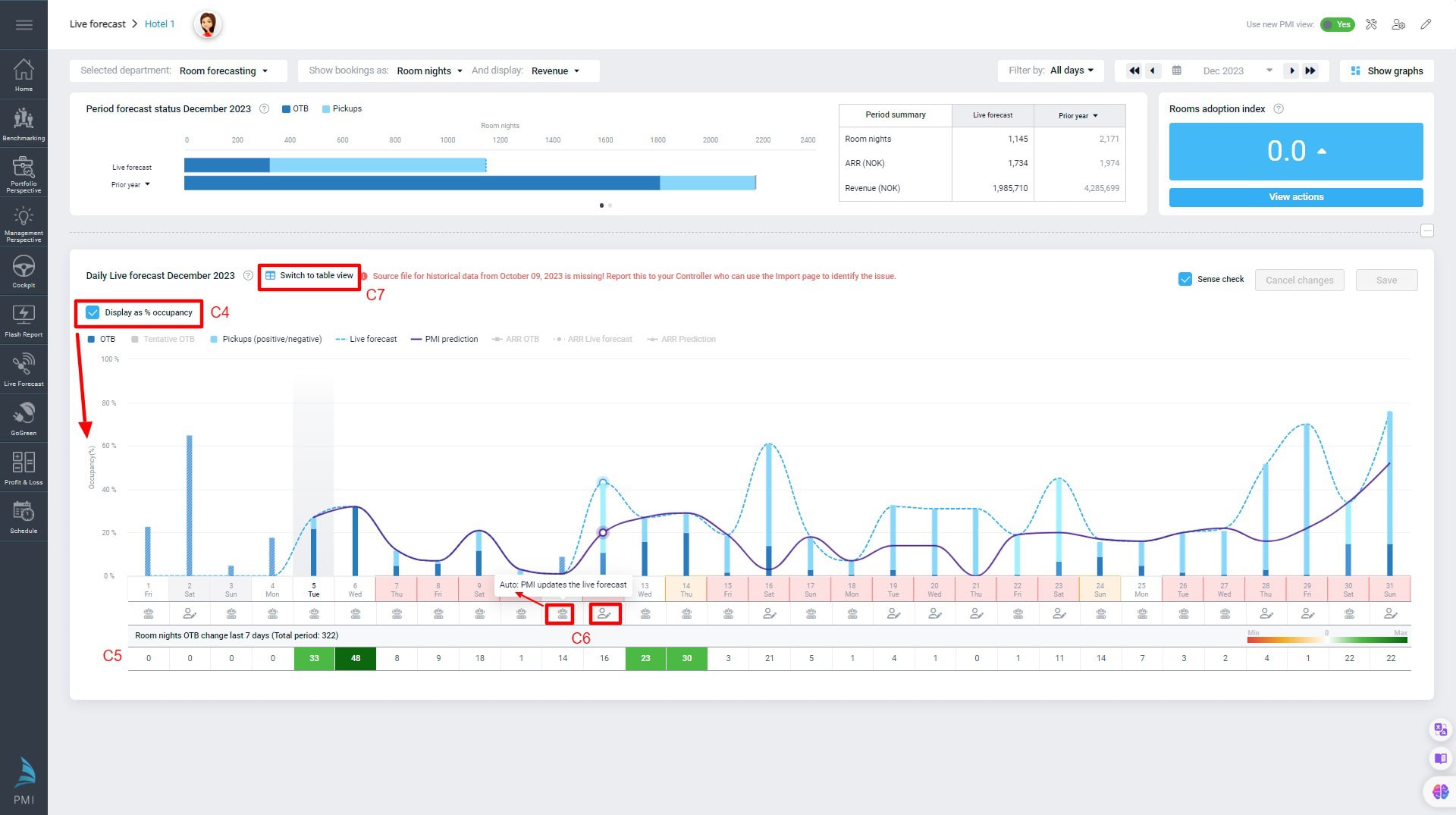
The daily Live forecast graph gives you an overview of the pickups and OTB for each day in a period, compared to the Live forecast and PMI prediction. You can select and deselect other comparison choices in the View options bar (C1).
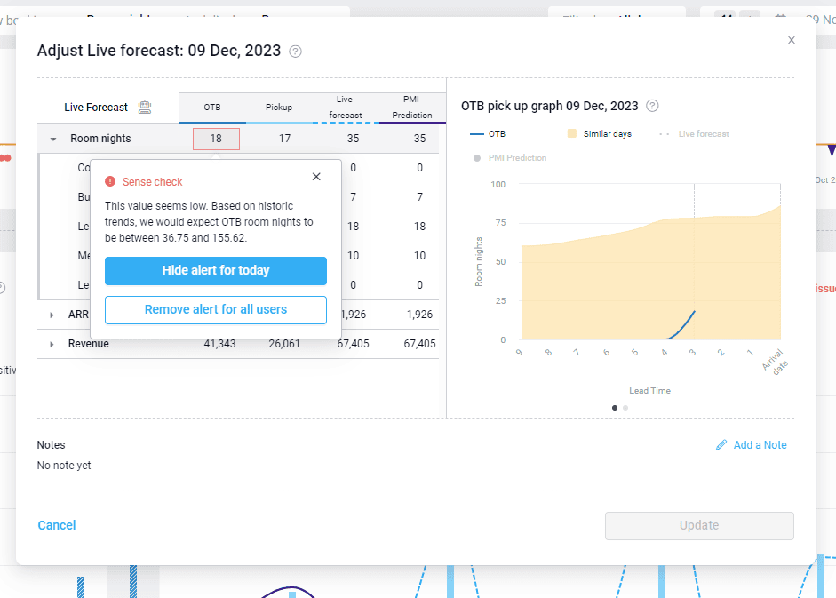
If you hover over a daily bar in the graph, it gives a breakdown of the numbers depending on your comparative view options selected. If you click on a daily bar (C2), a popup will appear that allows you to edit the pickups for that day without needing to switch to the table view (C3). If auto-forecasting is enabled, click the robot icon in the pop-up table to enable manual edits for that day. Don’t forget to press Save once you have made the necessary edits.
On the left side of the graph, the occupancy percentage is displayed for a quick overview of how you are booking compared to your availability. Deselecting Display as % occupancy (C4) will change the comparison to the number of Room nights.
Room nights OTB change last 7 days (C5) gives an overview of the changes in bookings in the past week. If the number is negative, that indicates you have had more cancellations than bookings for that day in the last 7 days.
The robot icon below the day (C6) indicates that the forecast was generated by PMI. If there is a person with a pencil icon, that indicates that manual changes were made, and PMI will not update the Live forecast for that day. An icon with a paper and arrow indicates that the Live forecast has been updated. Click the icon to make manual edits. However, note that these edits will be overwritten by the next import file received.
Select Switch to table view (C7) to view the same information in table format instead of a graph.
Table view
Table view options
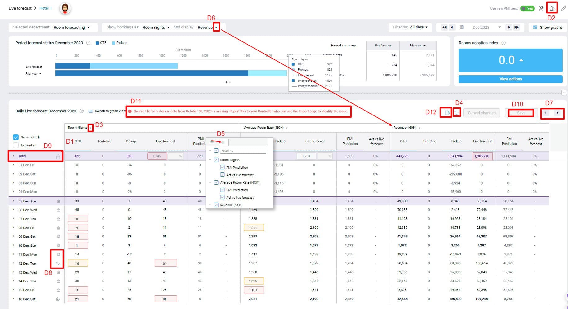
In the first section of columns (D1), you can view OTB, Tentative (if applicable), Pickups, Live forecast, PMI prediction and Actual vs Live forecast. There is also the option to add forecast and budget to the table via the personal view settings icon (D2) at the top right corner of the screen. Click here for more details on the personal view settings. Click on the arrow by Room nights (D3) to hide the reference columns.
You can drag and drop the reference columns to change the order within a section. For example, PMI prediction for Revenue could be dragged next to OTB in the Revenue section, if you prefer that order. All OTB, Tentative, Pickups and Live forecast columns are static because that is the main view. If you want to change everything back to the way it was, you can click the reset button (D4), which will put everything back to the default view.
Hover over any of the columns with PMI prediction and Actual vrs Live forecast, an icon with horizontal lines will appear (D5). If you click on the icon, a popup will appear with view options. Clicking on the vertical lines icon within the popup will open additional view options where you can select and deselect what you wish to see per column.
Click the arrow icon beside Revenue (D6) if you want to view Occupancy % in the table instead of Revenue. Click the forward and backward arrows (D7) to view any data that doesn’t fit on the page.
Making edits in the table
If you have PMI auto forecasting enabled, there will be a robot icon beside the day. Click on the robot to open the cell for editing (D8).To revert back to PMI prediction, click on the ‘person’ icon to enable the ‘robot’ again. You can use the PMI prediction column for reference.
If there is an import icon, click this to enable edits. Your manual edits will be overwritten when the next import file is received.
Hover over any day in a row, a blue notepad will pop up to the left of the row. Click to add a note explaining why an edit was made, or any other explanation for something out of the ordinary. This will then be visible in the graph as well as the table.
To make edits on the Total level, you need to be in the table view, and click on the padlock in the Total row (D9) and select Continue. You will then be able to change the value or percentage on a total level. This will update all the daily values and allocate the total proportionate according to PMI prediction on a daily level. It will turn off PMI prediction for all upcoming days and will be a manually overwritten number. The changes will be made across the table immediately, but you need to click Save (D10) in order to make the change permanent. If you don’t wish to keep the changes, select Cancel changes. If you have clicked Save, but later want to change back to PMI prediction, you can click the manual edit icon beside the date you wish to change and select the robot icon to enable PMI prediction again.
If any data is missing, you will get an alert (D11). You can also export any data that you have available on the table for the period selected by clicking on the export icon (D12).
Sense check explaination
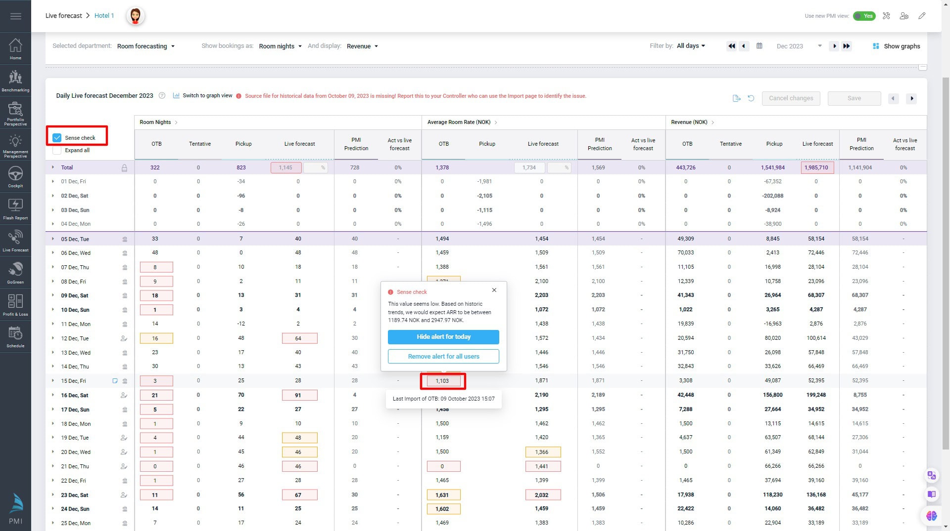
The sense check highlights values that are considered unusual. These are visible on both the daily graph and table view. Click on a day with an amber or red highlight to see the comments.
- ‘Hide alert for today’ will remove the alert from the page until the next data import. If it is a manually updated Live forecast, the alert will appear again the following morning if it is still relevant.
- ‘Remove alert for all users’ will delete the alert and it will not be shown again.
- If you make adjustments to the values, the sense check will refresh to reflect the new values.
- If you close the popup, the cell will remain highlighted, and you can return to it at a later time.
Sense check can highlight OTB and Live forecast values.
OTB values are compared with historical days in the same season. There are different alert thresholds for the different data points:
- Room nights
- Amber alert if the value is 25% higher or lower compared with historical days.
- Red alert if value is 50% higher or lower compared with historical days.
- ARR
- Amber alert if value is 10% higher or lower compared with historical days.
- Red alert if value is 33% higher or lower compared with historical days.
- Guest nights
- Amber alert if the value is double the average guest nights compared with historical days.
- Red alert if value is 50% higher or lower compared with historical days.
Live forecast values are highlighted if the difference between the Live forecast and PMI Prediction reaches a threshold:
- Room nights
- Amber alert if the value is 25% higher or lower than PMI Prediction.
- Red alert if the value is 40% higher or lower than PMI Prediction.
- ARR
- Amber alert if the value is 10% higher or lower than the PMI Prediction.
- Red alert if value is 33% higher or lower than PMI Prediction.
Show graphs
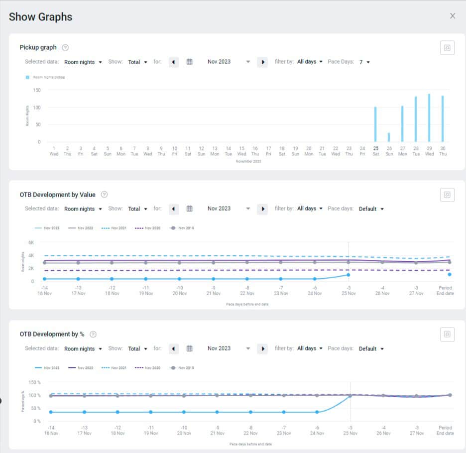
Here you can see the Pickup graph, which shows what you are picking up per day within a period, the OTB Development by value graph, which shows how your OTB has developed over time within a period, and OTB Development by %, which shows the percentage of how your OTB has developed compared to the Live forecast.
Color coded figures
On both the table and graph, some values are highlighted with a color:
Blue – The PMI prediction is constrained by the capacity. When a number is in blue, this indicates that PMI predicts that the property could sell more rooms than the max capacity. If you hover over the number in blue, the tooltip will show how many rooms it predicts could be sold.
Red – The number of rooms are above the capacity for that date. If the Forecast, Budget, or Live forecast are saved above the capacity, the figures will appear in red. If you hover over the red figures, a tooltip will display the maximum capacity, compared to what was imported and saved.
Purple – The day is a holiday. The Last Year column will be purple for the holiday dates it fell on last year, and the equivalent dates it falls on in the current year. I.e., the holiday’s results from last year will be shown twice, both where it actually was as well as where it will be this year.


