GoGreen Learning page overview
What is the purpose of GoGreen learning page?
GoGreen learning is an analysis tool which highlights how effective you have been in environmental and sustainability management. You can review resource consumption compared to previous periods and learn more about its composition and associated environmental impact as measured by Co2 and waste sorting rate.
Use this to evaluate if you are on track to meet the set sustainability targets and consider actions to be implemented to improve results. You can also evaluate patterns pertaining to peak time demands and identify major misalignments to identify short- and long-term actions to continuously minimize waste and cost.
It is PMI best practice to review the GoGreen learning page for each resource once a month to evaluate the past months results and consider actions to implement going forward.
As you review the page, consider the following questions:
- Which category (resource) is causing me not to reach my goal?
- Which day in the month is causing me not to reach my goal?
- How is my performance on the YOY(year on year) improvement compared to my peers?
- What kind of action should I take, corrective or preventative actions?
- In which period and activities does the variance occur when not reaching the YE (year end) goal?
What information is shown on the page?
The page can be accessed via the relevant resource cockpit. In the top left corner, select ‘Learning’
Select a cockpit, the data to be viewed (either consumption, cost or CO2) and the month to view.
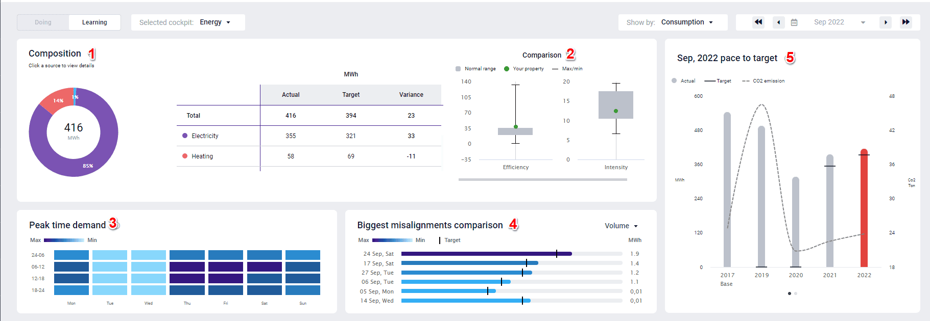
1. Composition: the donut shows the breakdown of total consumption in the various categories (resources).
- Click a section to review. This selection will affect all the graphs on the screen.
- In the data table (to the right of the doughnut), categories displayed are the resources from the cockpit and the amount for the selected period (Actual), and the last submitted forecast (Target).
- Review the variance (usually in bold) from Target and consider the reasons for any large deviations. Take not of any actions to be taken.
- Consumption = Mwh
- CO2 = Ton
- Cost = Currency (it will display your local currency)
2. Comparison: The boxplot graph displays how your property’s consumption compares to peers.
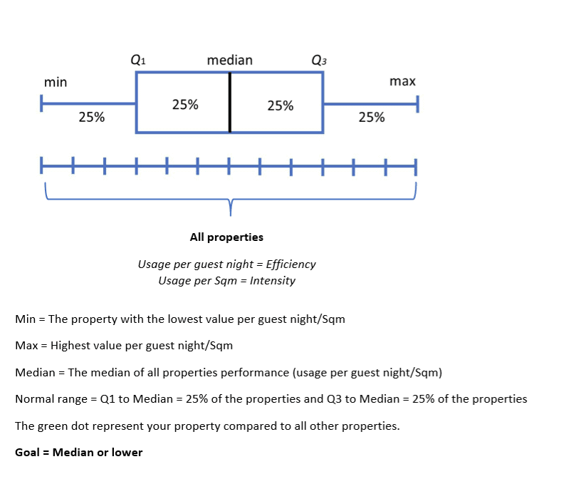
- The normal range displays what is considered ‘acceptable consumption’ compared to properties in your group or hotel chain.
- Max is the property with the highest value in the chain and Min the lowest value in the chain.
- The properties you are compared with are all the properties in the country of your chain. The center of the normal range is the median usage of all properties. The goal is always to be lower than the median.
3. Peak time demand shows the average hourly consumption as a heat map
- Use this to evaluate at what times you are consuming the most and consider ways to reduce consumption where possible.
- The demand is shown throughout the day in 4-time slots, from Monday to Sunday. The calculation is based on the highest consumption (Max) to the lowest consumption (Min). The default date is the first 7 days in the selected period.
- The heat map shows hourly figures and the average sum of the period selected per hour
Highest value to 10% lower = Deep dark blue color
10.01 % to 20% lower = Dark blue color
20.01 to 30% lower = Blue color
30.01% to 40% lower = Light blue color
40.01% to 50% = very light blue color
50.01% and lower = Soft white color
- For peak demand times consider the following questions: Which day(s) in the week should I take corrective actions? What causes these peaks? What can I do/stop doing, or do more of to lower the peak or shift the timing to off peak?
4. Biggest misalignments comparison graph displays the days in the selected period with the most significant deviations from target. It shows the top 6 days with the highest discrepancy between actual and target in the selected period. The graph (bars) shows the highest to the lowest. Highest value and until 10% lower = Deep dark blue color. Use the drop-down list to choose between Efficiency, Intensity or Volume.
10.01 % to 20% lower = Dark blue color
20.01 to 30% lower = Blue color
30.01% to 40% lower = Light blue color
40.01% to 50% = very light blue color
50.01% and lower = Soft white color
- Volume = Total usage/consumption
- Efficiency = per GN
- Intensity = per Sqm
5. Pace to target graph displays the actual consumption for the period selected compared to the target and all historical months. This allows you to evaluate the pace to reach year-end goal. This determines the sense of urgency for the subsequent steps and how aggressive you must be in identifying improvement actions. When the current year in the widget “YoY pace to goal” is above target, the “YTD consumption composition” displays the source that are causing the “YoY pace to goal” being above target. Click on the dots below to change between pace to target and year-end pace to target view. Deviation raises question, here are a few examples: Are you on pace to reach your year-end goals? If not, what is the main cause? What can I start/stop doing and do more of to achieve this?
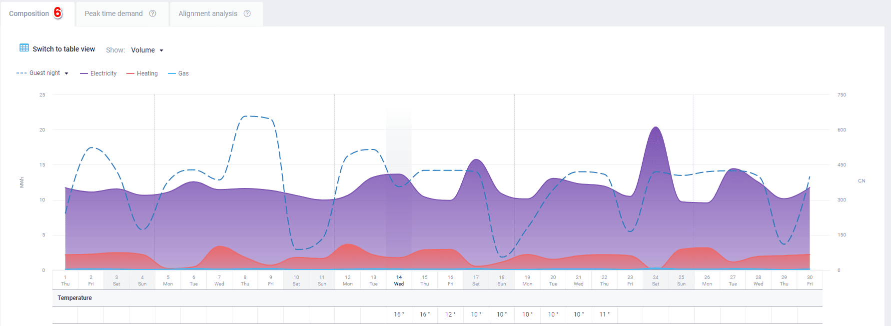
- Switch to table view for if so preferred
7. Peak time demand data table gives a complete overview for the selected period chosen. By clicking on the tab, it gives you an in depth look at #2. Efficiency presents the performance per GN (guest night) for the selected period. 100% is the best performance = highest efficiency per GN. Intensity presents the performance per Sqm of the selected period. 100% is the best performance = lowest intensity per Sqm.
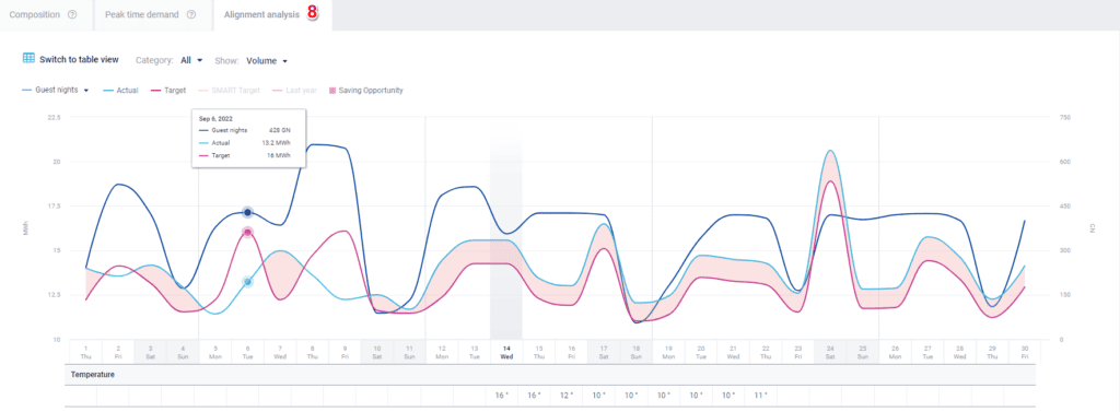
8. Alignment analysis graph represents the actual amount compared to the Target. Saving opportunities are the difference between Actual and Target values. It allows you to evaluate consumption alignment over time against selected KPIs (per GN, per RN and per Sqm). Deviation raises questions, here are a few examples: Is this consumption efficiency trending as planned? If not, what is the cause for this? What can I start/stop doing and do more of to reduce the resource consumption, especially the critical ones?
To summarise, GoGreen learning is an analysis tool which highlights how effective you have been in environmental and sustainability management. Use it to review resource consumption and evaluate if you are on track to meet your set sustainability targets. Review the GoGreen learning page for each resource once a month to evaluate the past month’s results and consider actions to implement going forward so that you can meet your targets.
